Extreme Value Analysis Tutorial
This notebook demonstrates how to use the ExtremesAnalyzer class for extreme value analysis, including return period calculations, block maxima extraction, and Peaks Over Threshold (POT) analysis.
Overview
ExtremesAnalyzer is designed to:
Calculate return periods and return values for extreme events
Extract block maxima (annual, monthly, seasonal)
Perform Peaks Over Threshold (POT) analysis with declustering
Fit extreme value distributions (GEV, Gumbel, Weibull, GPD)
Visualize return level plots
Handle flexible time series formats (pandas, datetime64, numeric arrays)
Setup and Data Generation
Let’s start by importing the necessary libraries and generating sample wind speed data using MagicA’s synthetic data generator.
[ ]:
import numpy as np
import pandas as pd
import matplotlib.pyplot as plt
import magica as ma
from magica.utils import generate_wind_data

# Generate 30 years of daily wind speed data using MagicA
wind_series, plots = generate_wind_data(
    n_years=30,
    freq='D',
    mean_wind=8.0,
    weibull_shape=2.5,
    seasonal_amplitude=0.3,
    n_storms_per_year=5,
    storm_duration_range=(2, 5),
    storm_intensity_range=(12, 20),
    random_seed=42,
    create_plots=True
)

# Display the plots
plt.show()

# Get basic statistics
dates = wind_series.index
wind_speeds = wind_series.values

print(f"Generated {len(wind_series)} daily wind speed measurements ({len(dates)/365:.1f} years)")
print(f"Date range: {dates[0].date()} to {dates[-1].date()}")
print(f"Min: {wind_speeds.min():.2f} m/s")
print(f"Max: {wind_speeds.max():.2f} m/s")
print(f"Mean: {wind_speeds.mean():.2f} m/s")
print(f"Std: {wind_speeds.std():.2f} m/s")
print(f"95th percentile: {np.percentile(wind_speeds, 95):.2f} m/s")
print(f"99th percentile: {np.percentile(wind_speeds, 99):.2f} m/s")
print(f"\n💡 Data generated using MagicA's generate_wind_data() function")
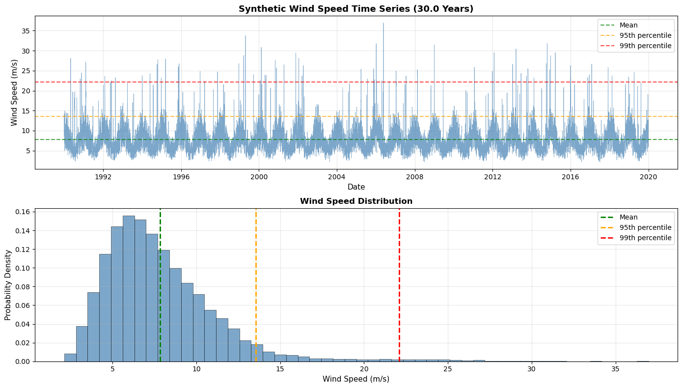
Generated 10957 daily wind speed measurements (30.0 years)
Date range: 1990-01-01 to 2019-12-31
Min: 2.11 m/s
Max: 36.96 m/s
Mean: 7.82 m/s
Std: 3.48 m/s
95th percentile: 13.55 m/s
99th percentile: 22.09 m/s

💡 Data generated using MagicA's generate_wind_data() function
Visualizing the Time Series
Let’s look at the complete time series and identify extreme events.
Basic Usage: Creating an ExtremesAnalyzer
The ExtremesAnalyzer can be created from a DataProcessor using the get_extremes_analyzer() method. It automatically handles pandas Series with datetime indices.
[6]:
# Load data using MagicA's DataProcessor
# The pandas Series with datetime index will be automatically preserved
processor = ma.read_data(wind_series)
print(f"Loaded data: {processor}")

# Create ExtremesAnalyzer (time_unit='years' for return periods in years)
extremes = processor.get_extremes_analyzer(time_unit='years')
print(f"\nCreated ExtremesAnalyzer: {extremes}")

# Check the time span
print(f"Time span: {extremes.time_span:.2f} years")
print(f"Number of observations: {len(extremes.data)}")
Loaded data: DataProcessor(length=10957, dtype=float64)

Created ExtremesAnalyzer: ExtremesAnalyzer(n_points=10957, time_span=30.0 years)
Time span: 30.00 years
Number of observations: 10957
Block Maxima Approach: Generalized Extreme Value (GEV) Distribution
The Block Maxima method extracts the maximum value from fixed time blocks (e.g., annual maxima) and fits a GEV distribution. This is the classical approach in extreme value theory.
[7]:
# Extract annual maxima
annual_maxima, years = extremes.extract_block_maxima(block_size='Y', method='max')
print(f"Annual Maxima Analysis:")
print(f"Number of years: {len(annual_maxima)}")
print(f"\nAnnual maximum wind speeds:")
for year, max_wind in zip(years, annual_maxima):
    print(f"  {year.year}: {max_wind:.2f} m/s")
print(f"\nStatistics of annual maxima:")
maxima_values = list(annual_maxima)
print(f"Mean: {np.mean(maxima_values):.2f} m/s")
print(f"Std: {np.std(maxima_values):.2f} m/s")
print(f"Min: {np.min(maxima_values):.2f} m/s")
print(f"Max: {np.max(maxima_values):.2f} m/s")
Annual Maxima Analysis:
Number of years: 30

Annual maximum wind speeds:
  1990: 28.12 m/s
  1991: 27.15 m/s
  1992: 23.58 m/s
  1993: 21.92 m/s
  1994: 27.78 m/s
  1995: 27.95 m/s
  1996: 24.83 m/s
  1997: 24.74 m/s
  1998: 26.78 m/s
  1999: 33.76 m/s
  2000: 30.86 m/s
  2001: 29.43 m/s
  2002: 28.12 m/s
  2003: 16.50 m/s
  2004: 21.75 m/s
  2005: 25.50 m/s
  2006: 36.96 m/s
  2007: 24.97 m/s
  2008: 25.25 m/s
  2009: 31.48 m/s
  2010: 20.04 m/s
  2011: 25.87 m/s
  2012: 29.53 m/s
  2013: 30.45 m/s
  2014: 31.82 m/s
  2015: 29.54 m/s
  2016: 26.29 m/s
  2017: 26.69 m/s
  2018: 23.72 m/s
  2019: 24.56 m/s

Statistics of annual maxima:
Mean: 26.86 m/s
Std: 4.08 m/s
Min: 16.50 m/s
Max: 36.96 m/s
/Users/danilocoutodesouza/Documents/Programs_and_scripts/MagicA/magica/core/extremes_analyzer.py:460: FutureWarning: 'Y' is deprecated and will be removed in a future version, please use 'YE' instead.
  resampled = series.resample(block_size).max()
[33]:
# Create a new processor with annual maxima
maxima_processor = ma.read_data(np.array(maxima_values))

# Instead of assuming a distribution, let's test several
# common extreme value distributions using AutoFitter
print("Testing multiple extreme value distributions...")
print("=" * 70)

# Define distributions commonly used for extreme values
extreme_distributions = [
    'genextreme',      # Generalized Extreme Value (GEV) - most general
    'gumbel_r',        # Gumbel (Type I) - special case of GEV
    'weibull_min',     # Weibull - commonly used for wind extremes
    'weibull_max',     # Weibull maximum
    'lognorm',         # Log-normal - sometimes used for extremes
    'gamma',           # Gamma distribution
    'exponweib'        # Exponentiated Weibull
]

# Create AutoFitter with extreme value distributions
auto_fitter = maxima_processor.get_auto_fitter(
    candidates=extreme_distributions,
    criterion='rmse'  # Use RMSE as primary criterion
)

# Find best distribution
print("\nFitting distributions to annual maxima...\n")
best_result = auto_fitter.fit_best_distribution()

print(f"Best Distribution: {best_result['distribution']}")
print(f"RMSE: {best_result['rmse']:.6f}")
print(f"AIC: {best_result['aic']:.2f}")
print(f"BIC: {best_result['bic']:.2f}")

# Use the best distribution for further analysis
best_dist_name = best_result['distribution']

# Create ExtremesAnalyzer with the best fitted distribution
maxima_extremes = maxima_processor.get_extremes_analyzer()
maxima_extremes.fit_distribution(best_dist_name)

# Get fitted parameters
params = maxima_extremes.fitted_params
print(f"\n" + "=" * 70)
print(f"BEST DISTRIBUTION: {best_dist_name.upper()}")
print("=" * 70)
print(f"Fitted Parameters: {[round(param) for param in params]}")

# Evaluate goodness-of-fit for best distribution
gof = maxima_extremes.goodness_of_fit(method='ks')
print(f"\nGoodness-of-Fit Statistics:")
print(f"  KS Statistic: {gof['ks_statistic']:.4f}")
print(f"  P-value: {gof['p_value']:.4f}")
print(f"  Result: {'GOOD FIT ✓' if gof['p_value'] > 0.05 else 'POOR FIT ✗'} (α = 0.05)")

print(f"\n💡 The {best_dist_name} distribution provides the best fit to the annual maxima")
print(f"   based on RMSE criterion. This will be used for return value calculations.")
Testing multiple extreme value distributions...
======================================================================

Fitting distributions to annual maxima...

Testing 7 distributions...
  [1/7] Fitting genextreme...
  [2/7] Fitting gumbel_r...
  [3/7] Fitting weibull_min...
  [4/7] Fitting weibull_max...
  [5/7] Fitting lognorm...
  [6/7] Fitting gamma...
  [7/7] Fitting exponweib...
✓ All distributions fitted successfully
Best Distribution: gamma
RMSE: 0.032312
AIC: 175.48
BIC: 179.69

======================================================================
BEST DISTRIBUTION: GAMMA
======================================================================
Fitted Parameters: [7708, -331, 0]

Goodness-of-Fit Statistics:
  KS Statistic: 0.0869
  P-value: 0.9624
  Result: GOOD FIT ✓ (α = 0.05)

💡 The gamma distribution provides the best fit to the annual maxima
   based on RMSE criterion. This will be used for return value calculations.
Return Period and Return Value Analysis
Now let’s calculate return values for different return periods (e.g., 10-year, 50-year, 100-year wind speeds).
Important Note on Workflow:
When working with block maxima (e.g., annual maxima), each data point already represents one time unit (e.g., 1 year)
The
ExtremesAnalyzercan fit distributions directly usingfit_distribution()No need to fit the distribution on the
DataProcessorfirstThe
time_unitparameter is mainly for the original time series, not for the extracted maxima
[34]:
# Calculate return values for various return periods
# The maxima_extremes analyzer already has the fitted distribution
return_periods = [2, 5, 10, 20, 50, 100]

print("Return Period Analysis (Block Maxima / GEV):")
print("=" * 60)
print(f"{'Return Period':<20} {'Return Value (m/s)':<20} {'Design Use'}")
print("-" * 60)

for T in return_periods:
    rv = maxima_extremes.return_value(T)

    # Suggest design use based on return period
    if T <= 5:
        design_use = "Operational limits"
    elif T <= 25:
        design_use = "Standard structures"
    elif T <= 50:
        design_use = "Important structures"
    else:
        design_use = "Critical infrastructure"

    print(f"{T} years{'':<13} {rv:.2f}{'':<15} {design_use}")

print("\n💡 Interpretation:")
print("   A 50-year return value has a 2% probability of being exceeded in any given year.")
print("   Over a 50-year period, there's approximately a 63.4% chance of exceeding this value.")
Return Period Analysis (Block Maxima / GEV):
============================================================
Return Period        Return Value (m/s)   Design Use
------------------------------------------------------------
2 years              26.85                Operational limits
5 years              30.29                Operational limits
10 years              32.10                Standard structures
20 years              33.60                Standard structures
50 years              35.29                Important structures
100 years              36.42                Critical infrastructure

💡 Interpretation:
   A 50-year return value has a 2% probability of being exceeded in any given year.
   Over a 50-year period, there's approximately a 63.4% chance of exceeding this value.
[35]:
# Calculate return periods for specific wind speed thresholds
threshold_speeds = [22, 24, 26, 28]

print("\nReturn Period for Specific Wind Speed Thresholds:")
print("=" * 60)
print(f"{'Wind Speed (m/s)':<20} {'Return Period (years)':<25} {'Probability/year'}")
print("-" * 60)

for speed in threshold_speeds:
    T = maxima_extremes.return_period(speed)
    prob = 1.0 / T if T > 0 else 0
    print(f"{speed}{'':<16} {T:.2f}{'':<21} {prob:.4f} ({prob*100:.2f}%)")

print("\n💡 Example: A wind speed of 25 m/s has a return period of X years,")
print("   meaning it's expected to be exceeded once every X years on average.")
Return Period for Specific Wind Speed Thresholds:
============================================================
Wind Speed (m/s)     Return Period (years)     Probability/year
------------------------------------------------------------
22                 1.13                      0.8837 (88.37%)
24                 1.32                      0.7581 (75.81%)
26                 1.72                      0.5824 (58.24%)
28                 2.57                      0.3889 (38.89%)

💡 Example: A wind speed of 25 m/s has a return period of X years,
   meaning it's expected to be exceeded once every X years on average.
Visualization: Return Level Plot
The return level plot is a fundamental diagnostic tool in extreme value analysis, showing both empirical and theoretical return levels.
[36]:
# Create return level plot
fig, ax = plt.subplots(figsize=(12, 7))

maxima_extremes.plot_return_levels(
    ax=ax,
    return_periods=np.logspace(np.log10(1.1), np.log10(200), 100),  # From 1.1 to 200 years
    confidence_level=0.95,
)

# Add reference lines for common design return periods
design_periods = [10, 50, 100]
for T in design_periods:
    rv = maxima_extremes.return_value(T)
    ax.axhline(rv, color='gray', linestyle=':', linewidth=1, alpha=0.5)
    ax.axvline(T, color='gray', linestyle=':', linewidth=1, alpha=0.5)
    ax.text(T * 1.1, rv, f'{T}-year: {rv:.1f} m/s', fontsize=9,
            bbox=dict(boxstyle='round,pad=0.3', facecolor='white', alpha=0.7))

plt.tight_layout()
plt.show()

print("\n📊 Return Level Plot Interpretation:")
print("   • Blue points: Empirical return levels from observed annual maxima")
print("   • Red line: Theoretical return levels from fitted GEV distribution")
print("   • Shaded area: 95% confidence interval (if calculated)")
print("   • Good agreement indicates the GEV model fits well")
print("   • Deviations at high return periods are common due to extrapolation")
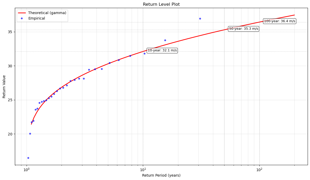
📊 Return Level Plot Interpretation:
   • Blue points: Empirical return levels from observed annual maxima
   • Red line: Theoretical return levels from fitted GEV distribution
   • Shaded area: 95% confidence interval (if calculated)
   • Good agreement indicates the GEV model fits well
   • Deviations at high return periods are common due to extrapolation
Peaks Over Threshold (POT) Approach: Generalized Pareto Distribution (GPD)
The POT method identifies all values exceeding a high threshold and fits a GPD to the exceedances. This approach uses more data than block maxima and can be more efficient.
[37]:
# Choose threshold (e.g., 95th percentile)
threshold = np.percentile(wind_speeds, 95)
print(f"Threshold for POT analysis: {threshold:.2f} m/s (95th percentile)")

# Extract peaks over threshold with declustering
# min_separation ensures peaks are independent (at least 3 days apart)
peaks, peak_times = extremes.peaks_over_threshold(
    threshold=threshold,
    min_separation=3  # days
)

print(f"\nPeaks Over Threshold Analysis:")
print(f"Number of peaks identified: {len(peaks)}")
print(f"Average exceedance rate: {len(peaks) / extremes.time_span:.2f} peaks/year")
print(f"\nFirst 10 peaks:")
for i, (peak, time) in enumerate(zip(peaks[:10], peak_times[:10])):
    print(f"  {i+1}. {time}: {peak:.2f} m/s (exceedance: {peak - threshold:.2f} m/s)")
Threshold for POT analysis: 13.55 m/s (95th percentile)

Peaks Over Threshold Analysis:
Number of peaks identified: 340
Average exceedance rate: 11.33 peaks/year

First 10 peaks:
  1. 1990-01-02 00:00:00: 14.16 m/s (exceedance: 0.61 m/s)
  2. 1990-01-12 00:00:00: 14.91 m/s (exceedance: 1.36 m/s)
  3. 1990-02-03 00:00:00: 14.01 m/s (exceedance: 0.46 m/s)
  4. 1990-02-20 00:00:00: 14.26 m/s (exceedance: 0.71 m/s)
  5. 1990-03-11 00:00:00: 14.40 m/s (exceedance: 0.85 m/s)
  6. 1990-05-01 00:00:00: 15.16 m/s (exceedance: 1.61 m/s)
  7. 1990-06-09 00:00:00: 19.67 m/s (exceedance: 6.12 m/s)
  8. 1990-07-13 00:00:00: 16.42 m/s (exceedance: 2.87 m/s)
  9. 1990-07-16 00:00:00: 15.82 m/s (exceedance: 2.26 m/s)
  10. 1990-08-25 00:00:00: 16.13 m/s (exceedance: 2.57 m/s)
[38]:
# Visualize the POT extraction
fig, ax = plt.subplots(figsize=(14, 6))

# Plot full time series
ax.plot(dates, wind_speeds, linewidth=0.5, alpha=0.5, color='steelblue', label='All data')

# Highlight threshold
ax.axhline(threshold, color='red', linestyle='--', linewidth=2, label=f'Threshold ({threshold:.2f} m/s)', alpha=0.7)

# Mark identified peaks
ax.scatter(peak_times, peaks, color='red', s=50, zorder=5, label=f'Peaks (n={len(peaks)})', alpha=0.8)

ax.set_xlabel('Date')
ax.set_ylabel('Wind Speed (m/s)')
ax.set_title('Peaks Over Threshold (POT) Identification with Declustering')
ax.legend(loc='upper right')
ax.grid(True, alpha=0.3)

plt.tight_layout()
plt.show()

print(f"\n💡 Declustering ensures peaks are independent (min {3} days apart)")
print(f"   This avoids counting multiple observations from the same storm event.")
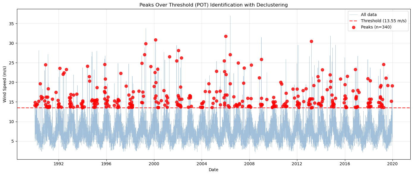
💡 Declustering ensures peaks are independent (min 3 days apart)
   This avoids counting multiple observations from the same storm event.
[39]:
# Fit GPD to exceedances (peaks - threshold)
exceedances = peaks - threshold

exceedance_processor = ma.read_data(exceedances)

# Create ExtremesAnalyzer for exceedances
# We specify time_unit='years' here because we'll need it for POT return value calculations
# (which depend on the exceedance rate per year from the original series)
pot_extremes = exceedance_processor.get_extremes_analyzer(time_unit='years')

# Fit GPD (genpareto in SciPy) directly on the extremes analyzer
pot_extremes.fit_distribution('genpareto')

# Get fitted parameters
gpd_params = pot_extremes.fitted_params
print(f"Fitted GPD Parameters (for exceedances):")
print(f"Shape (ξ): {gpd_params[0]:.4f}")
print(f"Location: {gpd_params[1]:.4f}")
print(f"Scale (σ): {gpd_params[2]:.4f}")

# Interpret the shape parameter
if gpd_params[0] > 0.1:
    print(f"\nInterpretation: Heavy-tailed distribution (higher probability of extremes)")
elif gpd_params[0] < -0.1:
    print(f"\nInterpretation: Short-tailed distribution (finite upper bound)")
else:
    print(f"\nInterpretation: Exponential-like tails")
Fitted GPD Parameters (for exceedances):
Shape (ξ): 0.2944
Location: 0.0022
Scale (σ): 2.0922

Interpretation: Heavy-tailed distribution (higher probability of extremes)
/Users/danilocoutodesouza/Documents/Programs_and_scripts/MagicA/magica/core/extremes_analyzer.py:113: UserWarning: No time information provided. Assuming uniform time spacing. Return periods will be in units of observation count.
  warnings.warn(
POT Return Value Calculation
For POT analysis, return values must account for the exceedance rate and threshold.
[40]:
# Calculate POT-based return values
# Return value = threshold + GPD quantile adjusted for exceedance rate

exceedance_rate = len(peaks) / extremes.time_span  # peaks per year

print("Return Period Analysis (POT / GPD):")
print("=" * 60)
print(f"Exceedance rate: {exceedance_rate:.2f} peaks/year")
print(f"Threshold: {threshold:.2f} m/s\n")
print(f"{'Return Period':<20} {'Return Value (m/s)':<20} {'Exceedance Level'}")
print("-" * 60)

for T in return_periods:
    # For POT, the return period relates to the probability of exceeding the threshold
    # P(X > x | X > u) = (1 - F_GPD(x-u))
    # Return level: x = u + scale * ((λT)^ξ - 1) / ξ, where λ is exceedance rate

    # Using the fitted GPD to calculate the quantile
    prob = 1.0 / (exceedance_rate * T)  # Probability in the GPD scale
    if prob < 1.0:
        exceedance_quantile = pot_extremes.ppf(1 - prob)
        rv_pot = threshold + exceedance_quantile
    else:
        rv_pot = np.nan

    if not np.isnan(rv_pot):
        exceedance = rv_pot - threshold
        print(f"{T} years{'':<13} {rv_pot:.2f}{'':<15} +{exceedance:.2f} m/s")
    else:
        print(f"{T} years{'':<13} {'N/A':<20} {'N/A'}")

print("\n💡 POT return values account for:")
print("   • The threshold level (base wind speed)")
print("   • The exceedance distribution (GPD)")
print("   • The rate of threshold exceedances")
Return Period Analysis (POT / GPD):
============================================================
Exceedance rate: 11.33 peaks/year
Threshold: 13.55 m/s

Return Period        Return Value (m/s)   Exceedance Level
------------------------------------------------------------
2 years              24.26                +10.71 m/s
5 years              29.78                +16.22 m/s
10 years              35.06                +21.50 m/s
20 years              41.53                +27.98 m/s
50 years              52.40                +38.85 m/s
100 years              62.80                +49.25 m/s

💡 POT return values account for:
   • The threshold level (base wind speed)
   • The exceedance distribution (GPD)
   • The rate of threshold exceedances
Comparing Block Maxima vs POT Approaches
Let’s compare the return value estimates from both methods.
Advanced Declustering: Event-Wise vs Time-Based Separation
When extracting peaks over threshold, we need to ensure independence between events. There are two main approaches:
Time-based separation: Keep peaks separated by a minimum time interval (e.g., 3 days)
Event-wise declustering: Identify consecutive periods above threshold as single events and extract only the maximum from each event
Let’s compare these approaches and see how different thresholds affect the number and characteristics of identified events.
[41]:
# Compare different declustering methods at 90th percentile
threshold_90 = np.percentile(wind_speeds, 90)

# Method 1: No declustering (all exceedances)
peaks_all, times_all = extremes.peaks_over_threshold(threshold=threshold_90)

# Method 2: Time-based separation (3 days)
peaks_3days, times_3days = extremes.peaks_over_threshold(
    threshold=threshold_90,
    min_separation=3
)

# Method 3: Event-wise (consecutive days as single event)
peaks_eventwise, times_eventwise = extremes.peaks_over_threshold(
    threshold=threshold_90,
    event_wise=True
)

print("Declustering Method Comparison (90th percentile threshold)")
print("=" * 70)
print(f"Threshold: {threshold_90:.2f} m/s")
print(f"\n{'Method':<25} {'# Peaks':<12} {'Mean Peak':<12} {'Max Peak'}")
print("-" * 70)
print(f"{'All exceedances':<25} {len(peaks_all):<12} {np.mean(peaks_all):<12.2f} {np.max(peaks_all):.2f}")
print(f"{'3-day separation':<25} {len(peaks_3days):<12} {np.mean(peaks_3days):<12.2f} {np.max(peaks_3days):.2f}")
print(f"{'Event-wise':<25} {len(peaks_eventwise):<12} {np.mean(peaks_eventwise):<12.2f} {np.max(peaks_eventwise):.2f}")

print(f"\n💡 Event-wise declustering identified {len(peaks_eventwise)} independent storm events")
print(f"   compared to {len(peaks_3days)} peaks with 3-day separation")
print(f"   and {len(peaks_all)} total exceedances.")
Declustering Method Comparison (90th percentile threshold)
======================================================================
Threshold: 11.78 m/s

Method                    # Peaks      Mean Peak    Max Peak
----------------------------------------------------------------------
All exceedances           1096         15.26        36.96
3-day separation          697          14.01        30.86
Event-wise                700          14.96        36.96

💡 Event-wise declustering identified 700 independent storm events
   compared to 697 peaks with 3-day separation
   and 1096 total exceedances.
[42]:
# Visualize the difference between declustering methods
fig, axes = plt.subplots(3, 1, figsize=(15, 12), sharex=True)

# Plot 1: All exceedances
ax = axes[0]
ax.plot(dates, wind_speeds, linewidth=0.5, alpha=0.5, color='steelblue', label='All data')
ax.axhline(threshold_90, color='orange', linestyle='--', linewidth=2,
           label=f'Threshold ({threshold_90:.2f} m/s)', alpha=0.7)
ax.scatter(times_all, peaks_all, color='red', s=30, zorder=5,
          label=f'All exceedances (n={len(peaks_all)})', alpha=0.6)
ax.set_ylabel('Wind Speed (m/s)')
ax.set_title('Method 1: All Exceedances (No Declustering)')
ax.legend(loc='upper right')
ax.grid(True, alpha=0.3)

# Plot 2: 3-day separation
ax = axes[1]
ax.plot(dates, wind_speeds, linewidth=0.5, alpha=0.5, color='steelblue', label='All data')
ax.axhline(threshold_90, color='orange', linestyle='--', linewidth=2,
           label=f'Threshold ({threshold_90:.2f} m/s)', alpha=0.7)
ax.scatter(times_3days, peaks_3days, color='green', s=50, zorder=5,
          label=f'3-day separation (n={len(peaks_3days)})', alpha=0.8, marker='^')
ax.set_ylabel('Wind Speed (m/s)')
ax.set_title('Method 2: Time-Based Declustering (3-day minimum separation)')
ax.legend(loc='upper right')
ax.grid(True, alpha=0.3)

# Plot 3: Event-wise
ax = axes[2]
ax.plot(dates, wind_speeds, linewidth=0.5, alpha=0.5, color='steelblue', label='All data')
ax.axhline(threshold_90, color='orange', linestyle='--', linewidth=2,
           label=f'Threshold ({threshold_90:.2f} m/s)', alpha=0.7)
ax.scatter(times_eventwise, peaks_eventwise, color='purple', s=60, zorder=5,
          label=f'Event-wise (n={len(peaks_eventwise)})', alpha=0.8, marker='*')
ax.set_xlabel('Date')
ax.set_ylabel('Wind Speed (m/s)')
ax.set_title('Method 3: Event-Wise Declustering (One peak per consecutive event)')
ax.legend(loc='upper right')
ax.grid(True, alpha=0.3)

plt.tight_layout()
plt.show()

print("\n📊 Interpretation:")
print("   • Top: Shows all days exceeding threshold (may include multiple days from same storm)")
print("   • Middle: Keeps peaks at least 3 days apart (may still miss some storm clusters)")
print("   • Bottom: One peak per storm event (consecutive days grouped together)")
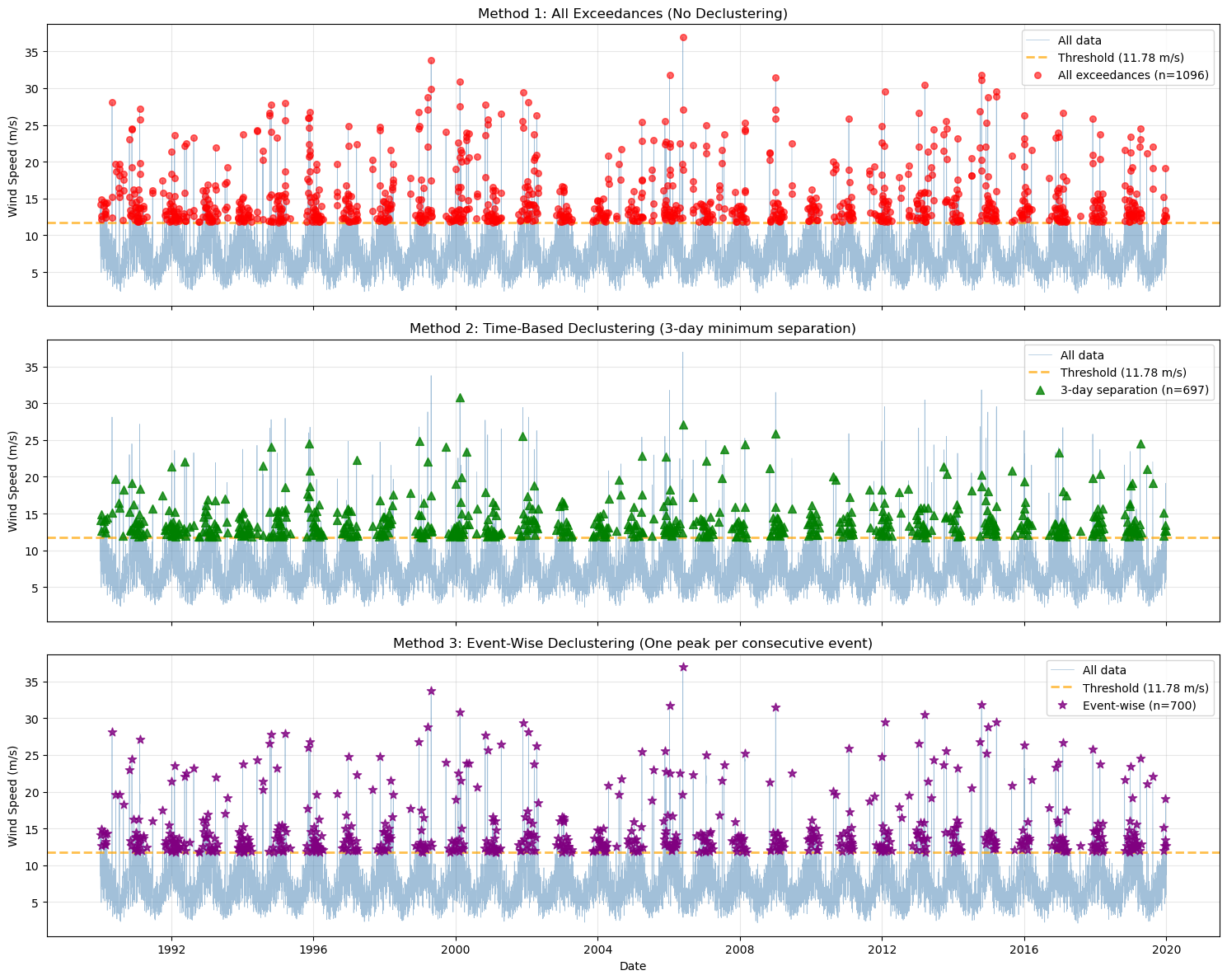
📊 Interpretation:
   • Top: Shows all days exceeding threshold (may include multiple days from same storm)
   • Middle: Keeps peaks at least 3 days apart (may still miss some storm clusters)
   • Bottom: One peak per storm event (consecutive days grouped together)
[43]:
# Zoom in on a specific storm event to illustrate the differences
# Find a period with multiple consecutive exceedances
exceedance_mask = wind_speeds > threshold_90
consecutive_periods = []
in_period = False
period_start = None

for i, (date, exceeds) in enumerate(zip(dates, exceedance_mask)):
    if exceeds and not in_period:
        # Start of a new period
        period_start = i
        in_period = True
    elif not exceeds and in_period:
        # End of period
        consecutive_periods.append((period_start, i - 1))
        in_period = False

# If still in a period at the end
if in_period:
    consecutive_periods.append((period_start, len(dates) - 1))

# Find the longest consecutive period (most interesting storm)
longest_period = max(consecutive_periods, key=lambda x: x[1] - x[0])
storm_center = (longest_period[0] + longest_period[1]) // 2

# Extract 1 month window around this storm (±15 days)
window_days = 15
zoom_start = max(0, storm_center - window_days)
zoom_end = min(len(dates) - 1, storm_center + window_days)

zoom_dates = dates[zoom_start:zoom_end+1]
zoom_winds = wind_speeds[zoom_start:zoom_end+1]

# Filter peaks to this window
mask_all = (times_all >= zoom_dates[0]) & (times_all <= zoom_dates[-1])
mask_3days = (times_3days >= zoom_dates[0]) & (times_3days <= zoom_dates[-1])
mask_eventwise = (times_eventwise >= zoom_dates[0]) & (times_eventwise <= zoom_dates[-1])

zoom_peaks_all = peaks_all[mask_all]
zoom_times_all = times_all[mask_all]
zoom_peaks_3days = peaks_3days[mask_3days]
zoom_times_3days = times_3days[mask_3days]
zoom_peaks_eventwise = peaks_eventwise[mask_eventwise]
zoom_times_eventwise = times_eventwise[mask_eventwise]

# Create detailed zoom plot
fig, axes = plt.subplots(3, 1, figsize=(15, 12), sharex=True)

# Plot 1: All exceedances
ax = axes[0]
ax.plot(zoom_dates, zoom_winds, linewidth=2, color='steelblue', label='Wind speed', alpha=0.8)
ax.axhline(threshold_90, color='orange', linestyle='--', linewidth=2,
           label=f'Threshold ({threshold_90:.2f} m/s)', alpha=0.7)
ax.scatter(zoom_times_all, zoom_peaks_all, color='red', s=80, zorder=5,
          label=f'All exceedances (n={len(zoom_peaks_all)})', alpha=0.8, edgecolors='darkred', linewidth=1.5)
ax.fill_between(zoom_dates, threshold_90, zoom_winds,
                where=(zoom_winds > threshold_90), alpha=0.2, color='red', label='Exceedance area')
ax.set_ylabel('Wind Speed (m/s)', fontsize=11)
ax.set_title('Method 1: All Exceedances - Zoom on Storm Event', fontsize=12, fontweight='bold')
ax.legend(loc='upper right', fontsize=10)
ax.grid(True, alpha=0.3)

# Plot 2: 3-day separation
ax = axes[1]
ax.plot(zoom_dates, zoom_winds, linewidth=2, color='steelblue', label='Wind speed', alpha=0.8)
ax.axhline(threshold_90, color='orange', linestyle='--', linewidth=2,
           label=f'Threshold ({threshold_90:.2f} m/s)', alpha=0.7)
ax.scatter(zoom_times_3days, zoom_peaks_3days, color='green', s=100, zorder=5,
          label=f'3-day separation (n={len(zoom_peaks_3days)})', alpha=0.8, marker='^',
          edgecolors='darkgreen', linewidth=1.5)
ax.fill_between(zoom_dates, threshold_90, zoom_winds,
                where=(zoom_winds > threshold_90), alpha=0.2, color='green', label='Exceedance area')
ax.set_ylabel('Wind Speed (m/s)', fontsize=11)
ax.set_title('Method 2: Time-Based Declustering - Zoom on Storm Event', fontsize=12, fontweight='bold')
ax.legend(loc='upper right', fontsize=10)
ax.grid(True, alpha=0.3)

# Plot 3: Event-wise
ax = axes[2]
ax.plot(zoom_dates, zoom_winds, linewidth=2, color='steelblue', label='Wind speed', alpha=0.8)
ax.axhline(threshold_90, color='orange', linestyle='--', linewidth=2,
           label=f'Threshold ({threshold_90:.2f} m/s)', alpha=0.7)
ax.scatter(zoom_times_eventwise, zoom_peaks_eventwise, color='purple', s=120, zorder=5,
          label=f'Event-wise (n={len(zoom_peaks_eventwise)})', alpha=0.8, marker='*',
          edgecolors='indigo', linewidth=1.5)
ax.fill_between(zoom_dates, threshold_90, zoom_winds,
                where=(zoom_winds > threshold_90), alpha=0.2, color='purple', label='Exceedance area')
ax.set_xlabel('Date', fontsize=11)
ax.set_ylabel('Wind Speed (m/s)', fontsize=11)
ax.set_title('Method 3: Event-Wise Declustering - Zoom on Storm Event', fontsize=12, fontweight='bold')
ax.legend(loc='upper right', fontsize=10)
ax.grid(True, alpha=0.3)

# Format x-axis
for ax in axes:
    ax.tick_params(axis='both', labelsize=10)

plt.tight_layout()
plt.show()

print(f"\n🔍 Detailed Storm Analysis:")
print(f"Period shown: {zoom_dates[0].date()} to {zoom_dates[-1].date()} (~1 month)")
print(f"Storm duration: {longest_period[1] - longest_period[0] + 1} consecutive days above threshold")
print(f"\nPeaks identified in this window:")
print(f"  • All exceedances: {len(zoom_peaks_all)} peaks")
print(f"  • 3-day separation: {len(zoom_peaks_3days)} peaks")
print(f"  • Event-wise: {len(zoom_peaks_eventwise)} peak(s)")
print(f"\n💡 Notice how:")
print(f"   - All exceedances captures every day above threshold (may count same storm multiple times)")
print(f"   - 3-day separation reduces but may still capture multiple peaks from one extended storm")
print(f"   - Event-wise correctly identifies this as a single storm event with one representative peak")
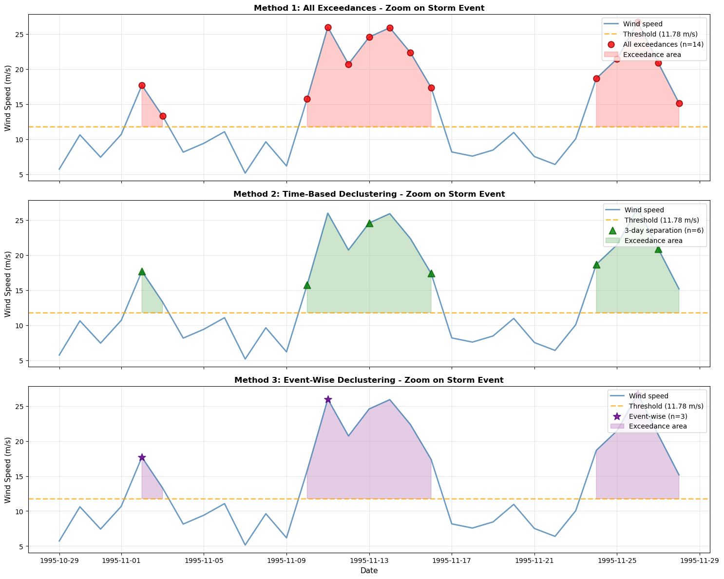
🔍 Detailed Storm Analysis:
Period shown: 1995-10-29 to 1995-11-28 (~1 month)
Storm duration: 7 consecutive days above threshold

Peaks identified in this window:
  • All exceedances: 14 peaks
  • 3-day separation: 6 peaks
  • Event-wise: 3 peak(s)

💡 Notice how:
   - All exceedances captures every day above threshold (may count same storm multiple times)
   - 3-day separation reduces but may still capture multiple peaks from one extended storm
   - Event-wise correctly identifies this as a single storm event with one representative peak
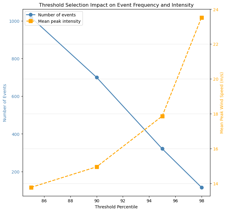
Impact of Threshold Selection on Event Identification
Different thresholds will identify different numbers of events with varying characteristics. Let’s explore how threshold choice affects the storm identification.
[44]:
# Test different thresholds with event-wise declustering
percentiles = [85, 90, 95, 98]
threshold_results = {}

for p in percentiles:
    thresh = np.percentile(wind_speeds, p)
    peaks_evt, times_evt = extremes.peaks_over_threshold(
        threshold=thresh,
        event_wise=True
    )

    # Calculate event statistics
    event_durations = []
    series = pd.Series(wind_speeds, index=dates)

    for event_time in times_evt:
        # Find the consecutive period around this peak
        event_mask = series > thresh
        # Find the continuous block containing this event
        idx_loc = series.index.get_loc(event_time)

        # Expand left
        start_idx = idx_loc
        while start_idx > 0 and event_mask.iloc[start_idx - 1]:
            start_idx -= 1

        # Expand right
        end_idx = idx_loc
        while end_idx < len(series) - 1 and event_mask.iloc[end_idx + 1]:
            end_idx += 1

        duration = end_idx - start_idx + 1
        event_durations.append(duration)

    threshold_results[p] = {
        'threshold': thresh,
        'n_events': len(peaks_evt),
        'mean_peak': np.mean(peaks_evt),
        'max_peak': np.max(peaks_evt),
        'mean_duration': np.mean(event_durations) if event_durations else 0,
        'max_duration': np.max(event_durations) if event_durations else 0,
        'peaks': peaks_evt,
        'times': times_evt
    }

# Display results
print("Impact of Threshold on Event Characteristics (Event-Wise Declustering)")
print("=" * 90)
print(f"{'Percentile':<12} {'Threshold':<12} {'# Events':<12} {'Mean Peak':<12} {'Mean Duration':<15} {'Max Duration'}")
print("-" * 90)

for p in percentiles:
    res = threshold_results[p]
    print(f"{p}th{'':<9} {res['threshold']:<12.2f} {res['n_events']:<12} "
          f"{res['mean_peak']:<12.2f} {res['mean_duration']:<15.1f} {res['max_duration']} days")

print("\n💡 Key Observations:")
print("   • Higher thresholds → Fewer but more intense events")
print("   • Lower thresholds → More events, including weaker/shorter storms")
print("   • Event duration shows how long storms persist above threshold")
Impact of Threshold on Event Characteristics (Event-Wise Declustering)
==========================================================================================
Percentile   Threshold    # Events     Mean Peak    Mean Duration   Max Duration
------------------------------------------------------------------------------------------
85th          10.76        1018         13.78        1.6             8 days
90th          11.78        700          14.96        1.6             7 days
95th          13.55        321          17.86        1.7             7 days
98th          17.57        116          23.53        1.9             5 days

💡 Key Observations:
   • Higher thresholds → Fewer but more intense events
   • Lower thresholds → More events, including weaker/shorter storms
   • Event duration shows how long storms persist above threshold
[46]:
# Visualize threshold impact
fig, ax = plt.subplots(1, 1, figsize=(8, 8))

# Plot: Number of events vs threshold
thresholds = [threshold_results[p]['threshold'] for p in percentiles]
n_events = [threshold_results[p]['n_events'] for p in percentiles]
mean_peaks = [threshold_results[p]['mean_peak'] for p in percentiles]

ax_twin = ax.twinx()
line1 = ax.plot(percentiles, n_events, 'o-', color='steelblue', linewidth=2,
                 markersize=8, label='Number of events')
line2 = ax_twin.plot(percentiles, mean_peaks, 's--', color='orange', linewidth=2,
                      markersize=8, label='Mean peak intensity')

ax.set_xlabel('Threshold Percentile')
ax.set_ylabel('Number of Events', color='steelblue')
ax_twin.set_ylabel('Mean Peak Wind Speed (m/s)', color='orange')
ax.set_title('Threshold Selection Impact on Event Frequency and Intensity')
ax.tick_params(axis='y', labelcolor='steelblue')
ax_twin.tick_params(axis='y', labelcolor='orange')
ax_twin.grid(True, alpha=0.3)

# Combine legends
lines = line1 + line2
labels = [l.get_label() for l in lines]
ax.legend(lines, labels, loc='upper left')

print("\n📊 Interpretation:")
print("   Left: Trade-off between event frequency and intensity")
print("   Right: Higher thresholds capture only the most persistent events")
📊 Interpretation:
   Left: Trade-off between event frequency and intensity
   Right: Higher thresholds capture only the most persistent events
Comparing GPD Fits: Event-Wise vs Time-Based Declustering
Let’s see how the choice of declustering method affects the fitted GPD distribution and return value estimates.
[47]:
# Compare GPD fits with different declustering methods
threshold_compare = threshold_90

# Get peaks with both methods
peaks_time, times_time = extremes.peaks_over_threshold(threshold=threshold_compare, min_separation=3)
peaks_event, times_event = extremes.peaks_over_threshold(threshold=threshold_compare, event_wise=True)

# Fit GPD to exceedances from both methods
exceedances_time = peaks_time - threshold_compare
exceedances_event = peaks_event - threshold_compare

# Time-based declustering
proc_time = ma.read_data(exceedances_time)
pot_time = proc_time.get_extremes_analyzer(time_unit='years')
pot_time.fit_distribution('genpareto')

# Event-wise declustering
proc_event = ma.read_data(exceedances_event)
pot_event = proc_event.get_extremes_analyzer(time_unit='years')
pot_event.fit_distribution('genpareto')

# Compare parameters
print("GPD Parameter Comparison")
print("=" * 70)
print(f"Threshold: {threshold_compare:.2f} m/s (90th percentile)")
print(f"\n{'Method':<25} {'# Peaks':<12} {'Shape (ξ)':<12} {'Scale (σ)'}")
print("-" * 70)

params_time = pot_time.fitted_params
params_event = pot_event.fitted_params

print(f"{'3-day separation':<25} {len(peaks_time):<12} {params_time[0]:<12.4f} {params_time[2]:.4f}")
print(f"{'Event-wise':<25} {len(peaks_event):<12} {params_event[0]:<12.4f} {params_event[2]:.4f}")

# Calculate return values
print("\n\nReturn Value Comparison (m/s)")
print("=" * 70)
print(f"{'Return Period':<20} {'3-day separation':<20} {'Event-wise':<20} {'Difference'}")
print("-" * 70)

rate_time = len(peaks_time) / extremes.time_span
rate_event = len(peaks_event) / extremes.time_span

for T in [10, 50, 100]:
    # Time-based
    prob_time = 1.0 / (rate_time * T)
    if prob_time < 1.0:
        rv_time = threshold_compare + pot_time.ppf(1 - prob_time)
    else:
        rv_time = np.nan

    # Event-wise
    prob_event = 1.0 / (rate_event * T)
    if prob_event < 1.0:
        rv_event = threshold_compare + pot_event.ppf(1 - prob_event)
    else:
        rv_event = np.nan

    if not np.isnan(rv_time) and not np.isnan(rv_event):
        diff = rv_event - rv_time
        print(f"{T} years{'':<13} {rv_time:<20.2f} {rv_event:<20.2f} {diff:+.2f}")

print("\n💡 Key Insights:")
print("   • Event-wise declustering reduces peak count (fewer independent events)")
print("   • This affects the exceedance rate and thus return value estimates")
print("   • Event-wise is more physically meaningful for clustered extremes (storms)")
print("   • Time-based separation is simpler but may over-count dependent events")
GPD Parameter Comparison
======================================================================
Threshold: 11.78 m/s (90th percentile)

Method                    # Peaks      Shape (ξ)    Scale (σ)
----------------------------------------------------------------------
3-day separation          697          0.1610       1.8546
Event-wise                700          0.4381       1.9109


Return Value Comparison (m/s)
======================================================================
Return Period        3-day separation     Event-wise           Difference
----------------------------------------------------------------------
10 years              27.96                54.97                +27.01
50 years              36.15                103.66               +67.51
100 years              40.39                137.81               +97.42

💡 Key Insights:
   • Event-wise declustering reduces peak count (fewer independent events)
   • This affects the exceedance rate and thus return value estimates
   • Event-wise is more physically meaningful for clustered extremes (storms)
   • Time-based separation is simpler but may over-count dependent events
/Users/danilocoutodesouza/Documents/Programs_and_scripts/MagicA/magica/core/extremes_analyzer.py:113: UserWarning: No time information provided. Assuming uniform time spacing. Return periods will be in units of observation count.
  warnings.warn(
[48]:
# Visualize the GPD fits
fig, (ax1, ax2) = plt.subplots(1, 2, figsize=(16, 6))

# Plot 1: Empirical vs fitted CDF
sorted_exc_time = np.sort(exceedances_time)
sorted_exc_event = np.sort(exceedances_event)

emp_cdf_time = np.arange(1, len(sorted_exc_time) + 1) / len(sorted_exc_time)
emp_cdf_event = np.arange(1, len(sorted_exc_event) + 1) / len(sorted_exc_event)

theo_cdf_time = pot_time.cdf(sorted_exc_time)
theo_cdf_event = pot_event.cdf(sorted_exc_event)

ax1.plot(sorted_exc_time, emp_cdf_time, 'o', color='blue', alpha=0.5,
         markersize=5, label='Empirical (3-day)')
ax1.plot(sorted_exc_time, theo_cdf_time, '-', color='blue', linewidth=2,
         label='GPD fit (3-day)')
ax1.plot(sorted_exc_event, emp_cdf_event, 's', color='red', alpha=0.5,
         markersize=5, label='Empirical (event-wise)')
ax1.plot(sorted_exc_event, theo_cdf_event, '-', color='red', linewidth=2,
         label='GPD fit (event-wise)')
ax1.set_xlabel('Exceedance (m/s)')
ax1.set_ylabel('Cumulative Probability')
ax1.set_title('GPD Fit Comparison: CDF')
ax1.legend()
ax1.grid(True, alpha=0.3)

# Plot 2: Q-Q plot
ax2.scatter(sorted_exc_time, pot_time.ppf(emp_cdf_time),
           color='blue', alpha=0.5, s=40, label='3-day separation')
ax2.scatter(sorted_exc_event, pot_event.ppf(emp_cdf_event),
           color='red', alpha=0.5, s=40, label='Event-wise', marker='s')

# Add diagonal line
max_val = max(np.max(sorted_exc_time), np.max(sorted_exc_event))
ax2.plot([0, max_val], [0, max_val], 'k--', linewidth=1, alpha=0.5, label='Perfect fit')

ax2.set_xlabel('Empirical Quantiles')
ax2.set_ylabel('Theoretical Quantiles (GPD)')
ax2.set_title('Q-Q Plot')
ax2.legend()
ax2.grid(True, alpha=0.3)
ax2.set_aspect('equal', adjustable='box')

plt.tight_layout()
plt.show()

print("\n📊 Plot Interpretation:")
print("   Left: Both methods show good GPD fits (empirical and theoretical CDFs align)")
print("   Right: Q-Q plot shows how well data follows GPD (points near diagonal = good fit)")
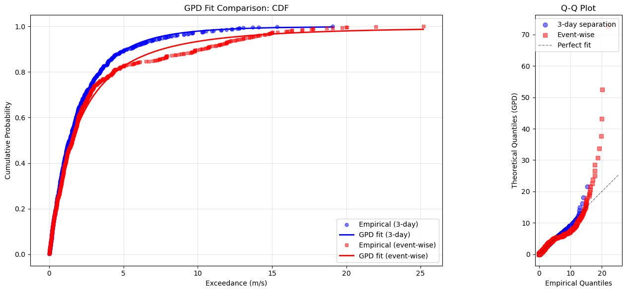
📊 Plot Interpretation:
   Left: Both methods show good GPD fits (empirical and theoretical CDFs align)
   Right: Q-Q plot shows how well data follows GPD (points near diagonal = good fit)
[49]:
# Calculate return values from both methods
comparison_periods = [5, 10, 20, 50, 100]

gev_values = [maxima_extremes.return_value(T) for T in comparison_periods]

# POT return values
pot_values = []
for T in comparison_periods:
    prob = 1.0 / (exceedance_rate * T)
    if prob < 1.0:
        exceedance_quantile = pot_extremes.ppf(1 - prob)
        pot_values.append(threshold + exceedance_quantile)
    else:
        pot_values.append(np.nan)

# Comparison table
print("Method Comparison: Block Maxima (GEV) vs POT (GPD)")
print("=" * 80)
print(f"{'Return Period':<15} {'GEV (m/s)':<15} {'GPD (m/s)':<15} {'Difference':<15} {'% Diff'}")
print("-" * 80)

for T, gev_val, pot_val in zip(comparison_periods, gev_values, pot_values):
    if not np.isnan(pot_val):
        diff = pot_val - gev_val
        pct_diff = (diff / gev_val) * 100
        print(f"{T} years{'':<8} {gev_val:<15.2f} {pot_val:<15.2f} {diff:<+15.2f} {pct_diff:+.1f}%")
    else:
        print(f"{T} years{'':<8} {gev_val:<15.2f} {'N/A':<15} {'N/A':<15} {'N/A'}")

print("\n📊 Method Selection Guidelines:")
print("\nBlock Maxima (GEV):")
print("  ✓ More robust, classical approach")
print("  ✓ Less sensitive to threshold selection")
print("  ✓ Better for data with clear seasonal structure")
print("  ✗ Uses less data (only one value per block)")
print("  ✗ Requires long time series for reliability")
print("\nPeaks Over Threshold (GPD):")
print("  ✓ More efficient, uses more extreme data")
print("  ✓ Better for short time series")
print("  ✓ Can adapt to changing extreme behavior")
print("  ✗ Sensitive to threshold choice")
print("  ✗ Requires careful declustering")
print("  ✗ More complex implementation")
Method Comparison: Block Maxima (GEV) vs POT (GPD)
================================================================================
Return Period   GEV (m/s)       GPD (m/s)       Difference      % Diff
--------------------------------------------------------------------------------
5 years         30.29           29.78           -0.52           -1.7%
10 years         32.10           35.06           +2.96           +9.2%
20 years         33.60           41.53           +7.93           +23.6%
50 years         35.29           52.40           +17.11          +48.5%
100 years         36.42           62.80           +26.38          +72.4%

📊 Method Selection Guidelines:

Block Maxima (GEV):
  ✓ More robust, classical approach
  ✓ Less sensitive to threshold selection
  ✓ Better for data with clear seasonal structure
  ✗ Uses less data (only one value per block)
  ✗ Requires long time series for reliability

Peaks Over Threshold (GPD):
  ✓ More efficient, uses more extreme data
  ✓ Better for short time series
  ✓ Can adapt to changing extreme behavior
  ✗ Sensitive to threshold choice
  ✗ Requires careful declustering
  ✗ More complex implementation
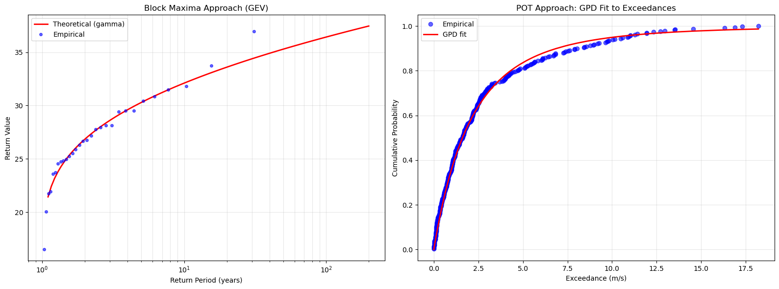
Visualizing Both Approaches Side-by-Side
[50]:
# Create comparison plot
fig, (ax1, ax2) = plt.subplots(1, 2, figsize=(16, 6))

# Plot 1: GEV return levels
maxima_extremes.plot_return_levels(
    ax=ax1,
    return_periods=np.logspace(np.log10(1.1), np.log10(200), 100),
    confidence_level=0.95,
    title='Block Maxima Approach (GEV)'
)

# Plot 2: Exceedance distribution (GPD)
sorted_exceedances = np.sort(exceedances)
empirical_cdf = np.arange(1, len(sorted_exceedances) + 1) / len(sorted_exceedances)
theoretical_cdf = pot_extremes.cdf(sorted_exceedances)

ax2.plot(sorted_exceedances, empirical_cdf, 'bo', markersize=6, alpha=0.6, label='Empirical')
ax2.plot(sorted_exceedances, theoretical_cdf, 'r-', linewidth=2, label='GPD fit')
ax2.set_xlabel('Exceedance (m/s)')
ax2.set_ylabel('Cumulative Probability')
ax2.set_title('POT Approach: GPD Fit to Exceedances')
ax2.legend()
ax2.grid(True, alpha=0.3)

plt.tight_layout()
plt.show()
Advanced: Monthly and Seasonal Block Maxima
Besides annual maxima, we can extract maxima from other time blocks.
[51]:
# Extract monthly maxima
monthly_maxima = extremes.extract_block_maxima(block_size='M', method='max')

print(f"Monthly Maxima Analysis:")
print(f"Number of months: {len(monthly_maxima[1])}")
print(f"Mean monthly maximum: {np.mean(list(monthly_maxima[0])):.2f} m/s")
print(f"\nFirst 12 months:")
for max_wind, month in zip(monthly_maxima[0][:12], monthly_maxima[1][:12]):
    print(f"{month.month}: {max_wind:.2f} m/s")
Monthly Maxima Analysis:
Number of months: 360
Mean monthly maximum: 15.32 m/s

First 12 months:
1: 14.91 m/s
2: 14.54 m/s
3: 14.40 m/s
4: 10.28 m/s
5: 28.12 m/s
6: 19.67 m/s
7: 19.66 m/s
8: 18.29 m/s
9: 10.83 m/s
10: 23.00 m/s
11: 24.49 m/s
12: 16.24 m/s
/Users/danilocoutodesouza/Documents/Programs_and_scripts/MagicA/magica/core/extremes_analyzer.py:460: FutureWarning: 'M' is deprecated and will be removed in a future version, please use 'ME' instead.
  resampled = series.resample(block_size).max()
[52]:
# Visualize seasonal variation in extremes
# Convert monthly maxima to DataFrame for easier analysis
# monthly_maxima is a tuple of (values, timestamps)
monthly_values, monthly_dates = monthly_maxima

monthly_df = pd.DataFrame({
    'date': monthly_dates,
    'max_wind': monthly_values
})
monthly_df['month'] = monthly_df['date'].dt.month
monthly_df['month_name'] = monthly_df['date'].dt.strftime('%b')

# Calculate monthly statistics
monthly_stats = monthly_df.groupby(['month', 'month_name'])['max_wind'].agg(['mean', 'std', 'min', 'max']).reset_index()

fig, ax = plt.subplots(figsize=(12, 6))

# Plot mean with error bars
months = monthly_stats['month'].values
means = monthly_stats['mean'].values
stds = monthly_stats['std'].values

ax.plot(months, means, 'o-', linewidth=2, markersize=8, color='steelblue', label='Mean monthly maximum')
ax.fill_between(months, means - stds, means + stds, alpha=0.3, color='steelblue', label='±1 std')
ax.scatter(months, monthly_stats['max'], color='red', s=50, zorder=5, alpha=0.6, label='Absolute maximum')

ax.set_xlabel('Month')
ax.set_ylabel('Wind Speed (m/s)')
ax.set_title('Seasonal Variation in Monthly Maximum Wind Speeds')
ax.set_xticks(months)
ax.set_xticklabels(monthly_stats['month_name'])
ax.legend()
ax.grid(True, alpha=0.3)

plt.tight_layout()
plt.show()

# Find the most extreme month
most_extreme_month = monthly_stats.loc[monthly_stats['mean'].idxmax()]
print(f"\nMost extreme month on average: {most_extreme_month['month_name']} ({most_extreme_month['mean']:.2f} m/s)")
print(f"Least extreme month on average: {monthly_stats.loc[monthly_stats['mean'].idxmin(), 'month_name']} "
      f"({monthly_stats['mean'].min():.2f} m/s)")
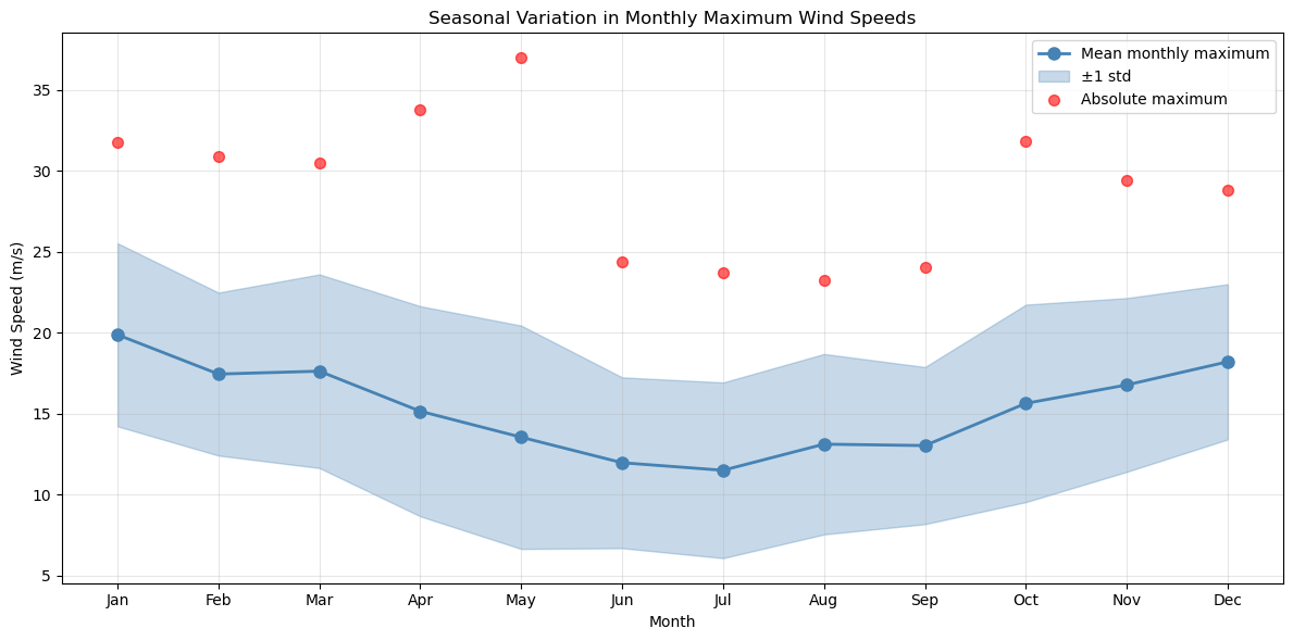
Most extreme month on average: Jan (19.87 m/s)
Least extreme month on average: Jul (11.50 m/s)
Goodness-of-Fit Assessment for Extreme Value Distributions
Let’s evaluate how well our distributions fit the extreme data using both statistical tests and visual diagnostics.
[53]:
# Goodness-of-fit for GEV (annual maxima)
print("Goodness-of-Fit Assessment:")
print("=" * 60)
print("\nBlock Maxima (GEV):")

ks_gev = maxima_extremes.goodness_of_fit('ks')
print(f"  Kolmogorov-Smirnov Test:")
print(f"    Statistic: {ks_gev['ks_statistic']:.6f}")
print(f"    P-value: {ks_gev['p_value']:.6f}")
print(f"    Result: {'Good fit ✓' if ks_gev['p_value'] > 0.05 else 'Poor fit ✗'} (α = 0.05)")

rmse_gev = maxima_extremes.goodness_of_fit('rmse')
print(f"  RMSE: {rmse_gev:.6f}")

# Goodness-of-fit for GPD (exceedances)
print("\nPeaks Over Threshold (GPD):")

ks_gpd = pot_extremes.goodness_of_fit('ks')
print(f"  Kolmogorov-Smirnov Test:")
print(f"    Statistic: {ks_gpd['ks_statistic']:.6f}")
print(f"    P-value: {ks_gpd['p_value']:.6f}")
print(f"    Result: {'Good fit ✓' if ks_gpd['p_value'] > 0.05 else 'Poor fit ✗'} (α = 0.05)")

rmse_gpd = pot_extremes.goodness_of_fit('rmse')
print(f"  RMSE: {rmse_gpd:.6f}")

print("\n💡 Note: Small sample sizes in extreme value analysis often result in")
print("   lower statistical power. Visual inspection (see plots below) is equally important.")
Goodness-of-Fit Assessment:
============================================================

Block Maxima (GEV):
  Kolmogorov-Smirnov Test:
    Statistic: 0.086928
    P-value: 0.962403
    Result: Good fit ✓ (α = 0.05)
  RMSE: 0.032312

Peaks Over Threshold (GPD):
  Kolmogorov-Smirnov Test:
    Statistic: 0.042619
    P-value: 0.552774
    Result: Good fit ✓ (α = 0.05)
  RMSE: 0.018108

💡 Note: Small sample sizes in extreme value analysis often result in
   lower statistical power. Visual inspection (see plots below) is equally important.
Visual Goodness-of-Fit: Histograms and PDFs
Let’s visualize how well the fitted distributions match the observed data by comparing histograms with the theoretical probability density functions (PDFs).
[54]:
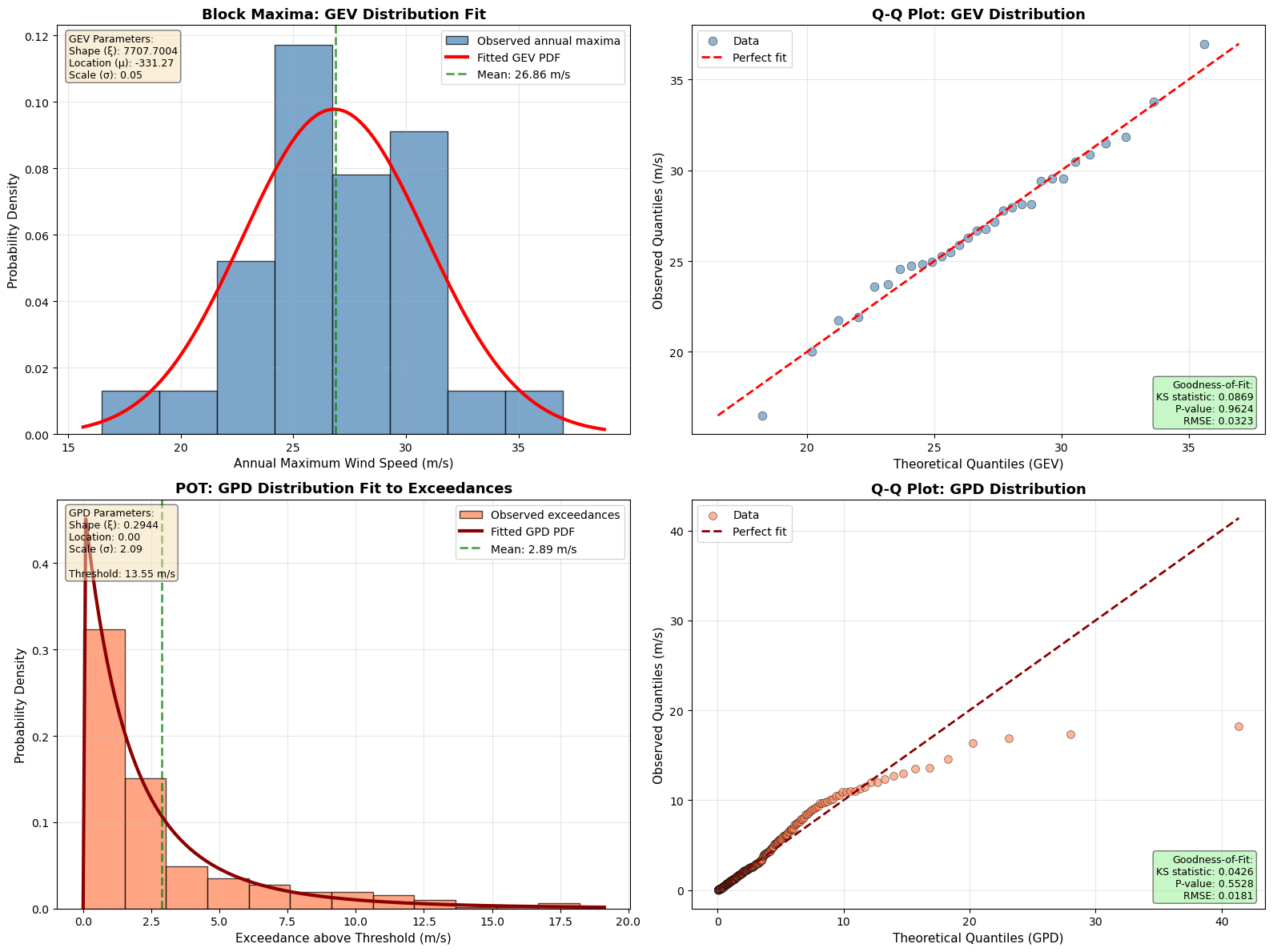
# Create comprehensive visualization of goodness-of-fit
fig, axes = plt.subplots(2, 2, figsize=(16, 12))

# ============================================================================
# TOP ROW: Block Maxima (GEV) Analysis
# ============================================================================

# Plot 1: Histogram + PDF for Annual Maxima (GEV)
ax1 = axes[0, 0]
ax1.hist(maxima_values, bins=8, density=True, alpha=0.7, color='steelblue',
         label='Observed annual maxima', edgecolor='black', linewidth=1)

# Generate smooth curve for fitted GEV distribution
x_gev = np.linspace(min(maxima_values) * 0.95, max(maxima_values) * 1.05, 200)
pdf_gev = maxima_extremes.pdf(x_gev)
ax1.plot(x_gev, pdf_gev, 'r-', linewidth=3, label='Fitted GEV PDF')

# Mark the mean
mean_maxima = np.mean(maxima_values)
ax1.axvline(mean_maxima, color='green', linestyle='--', linewidth=2,
            label=f'Mean: {mean_maxima:.2f} m/s', alpha=0.7)

ax1.set_xlabel('Annual Maximum Wind Speed (m/s)', fontsize=11)
ax1.set_ylabel('Probability Density', fontsize=11)
ax1.set_title('Block Maxima: GEV Distribution Fit', fontsize=13, fontweight='bold')
ax1.legend(loc='upper right', fontsize=10)
ax1.grid(True, alpha=0.3)

# Add text box with GEV parameters
param_text = f'GEV Parameters:\nShape (ξ): {params[0]:.4f}\nLocation (μ): {params[1]:.2f}\nScale (σ): {params[2]:.2f}'
ax1.text(0.02, 0.98, param_text, transform=ax1.transAxes, fontsize=9,
         verticalalignment='top', bbox=dict(boxstyle='round', facecolor='wheat', alpha=0.5))

# Plot 2: Q-Q Plot for GEV
ax2 = axes[0, 1]
sorted_maxima = np.sort(maxima_values)
n = len(sorted_maxima)
empirical_probs = (np.arange(1, n + 1) - 0.5) / n
theoretical_quantiles = maxima_extremes.ppf(empirical_probs)

ax2.scatter(theoretical_quantiles, sorted_maxima, alpha=0.6, s=60, color='steelblue',
            edgecolor='black', linewidth=0.5, label='Data')
# Add perfect fit line
min_val = min(theoretical_quantiles.min(), sorted_maxima.min())
max_val = max(theoretical_quantiles.max(), sorted_maxima.max())
ax2.plot([min_val, max_val], [min_val, max_val], 'r--', linewidth=2, label='Perfect fit')

ax2.set_xlabel('Theoretical Quantiles (GEV)', fontsize=11)
ax2.set_ylabel('Observed Quantiles (m/s)', fontsize=11)
ax2.set_title('Q-Q Plot: GEV Distribution', fontsize=13, fontweight='bold')
ax2.legend(loc='upper left', fontsize=10)
ax2.grid(True, alpha=0.3)

# Add goodness-of-fit statistics
gof_text = f'Goodness-of-Fit:\nKS statistic: {ks_gev["ks_statistic"]:.4f}\nP-value: {ks_gev["p_value"]:.4f}\nRMSE: {rmse_gev:.4f}'
ax2.text(0.98, 0.02, gof_text, transform=ax2.transAxes, fontsize=9,
         verticalalignment='bottom', horizontalalignment='right',
         bbox=dict(boxstyle='round', facecolor='lightgreen' if ks_gev['p_value'] > 0.05 else 'lightcoral', alpha=0.5))

# ============================================================================
# BOTTOM ROW: POT (GPD) Analysis
# ============================================================================

# Plot 3: Histogram + PDF for Exceedances (GPD)
ax3 = axes[1, 0]
ax3.hist(exceedances, bins=12, density=True, alpha=0.7, color='coral',
         label='Observed exceedances', edgecolor='black', linewidth=1)

# Generate smooth curve for fitted GPD distribution
x_gpd = np.linspace(0, max(exceedances) * 1.05, 200)
pdf_gpd = pot_extremes.pdf(x_gpd)
ax3.plot(x_gpd, pdf_gpd, 'darkred', linewidth=3, label='Fitted GPD PDF')

# Mark the mean
mean_exceedances = np.mean(exceedances)
ax3.axvline(mean_exceedances, color='green', linestyle='--', linewidth=2,
            label=f'Mean: {mean_exceedances:.2f} m/s', alpha=0.7)

ax3.set_xlabel('Exceedance above Threshold (m/s)', fontsize=11)
ax3.set_ylabel('Probability Density', fontsize=11)
ax3.set_title('POT: GPD Distribution Fit to Exceedances', fontsize=13, fontweight='bold')
ax3.legend(loc='upper right', fontsize=10)
ax3.grid(True, alpha=0.3)

# Add text box with GPD parameters
param_text_gpd = f'GPD Parameters:\nShape (ξ): {gpd_params[0]:.4f}\nLocation: {gpd_params[1]:.2f}\nScale (σ): {gpd_params[2]:.2f}\n\nThreshold: {threshold:.2f} m/s'
ax3.text(0.02, 0.98, param_text_gpd, transform=ax3.transAxes, fontsize=9,
         verticalalignment='top', bbox=dict(boxstyle='round', facecolor='wheat', alpha=0.5))

# Plot 4: Q-Q Plot for GPD
ax4 = axes[1, 1]
sorted_exceedances = np.sort(exceedances)
n_exc = len(sorted_exceedances)
empirical_probs_exc = (np.arange(1, n_exc + 1) - 0.5) / n_exc
theoretical_quantiles_exc = pot_extremes.ppf(empirical_probs_exc)

ax4.scatter(theoretical_quantiles_exc, sorted_exceedances, alpha=0.6, s=50, color='coral',
            edgecolor='black', linewidth=0.5, label='Data')
# Add perfect fit line
min_val_exc = min(theoretical_quantiles_exc.min(), sorted_exceedances.min())
max_val_exc = max(theoretical_quantiles_exc.max(), sorted_exceedances.max())
ax4.plot([min_val_exc, max_val_exc], [min_val_exc, max_val_exc], 'darkred',
         linestyle='--', linewidth=2, label='Perfect fit')

ax4.set_xlabel('Theoretical Quantiles (GPD)', fontsize=11)
ax4.set_ylabel('Observed Quantiles (m/s)', fontsize=11)
ax4.set_title('Q-Q Plot: GPD Distribution', fontsize=13, fontweight='bold')
ax4.legend(loc='upper left', fontsize=10)
ax4.grid(True, alpha=0.3)

# Add goodness-of-fit statistics
gof_text_gpd = f'Goodness-of-Fit:\nKS statistic: {ks_gpd["ks_statistic"]:.4f}\nP-value: {ks_gpd["p_value"]:.4f}\nRMSE: {rmse_gpd:.4f}'
ax4.text(0.98, 0.02, gof_text_gpd, transform=ax4.transAxes, fontsize=9,
         verticalalignment='bottom', horizontalalignment='right',
         bbox=dict(boxstyle='round', facecolor='lightgreen' if ks_gpd['p_value'] > 0.05 else 'lightcoral', alpha=0.5))

plt.tight_layout()
plt.show()

print("\n" + "="*80)
print("VISUAL GOODNESS-OF-FIT INTERPRETATION:")
print("="*80)
print("\n📊 LEFT COLUMN - Histogram vs PDF:")
print("   • Blue/Coral bars: Observed frequency of extreme values")
print("   • Red curves: Theoretical probability density from fitted distributions")
print("   • Good fit: PDF curve should follow the histogram shape closely")
print("   • Green dashed line: Mean of the observed data")
print("\n📈 RIGHT COLUMN - Q-Q Plots (Quantile-Quantile):")
print("   • Points: Comparison of observed vs theoretical quantiles")
print("   • Red dashed line: Perfect fit (y = x)")
print("   • Good fit: Points should lie close to the diagonal line")
print("   • Deviations at extremes are common due to sampling variability")
print("\n✅ GEV (Top Row):")
print(f"   • P-value: {ks_gev['p_value']:.4f} → {'GOOD FIT' if ks_gev['p_value'] > 0.05 else 'POOR FIT'} (α = 0.05)")
print(f"   • RMSE: {rmse_gev:.6f} (lower is better)")
print("\n✅ GPD (Bottom Row):")
print(f"   • P-value: {ks_gpd['p_value']:.4f} → {'GOOD FIT' if ks_gpd['p_value'] > 0.05 else 'POOR FIT'} (α = 0.05)")
print(f"   • RMSE: {rmse_gpd:.6f} (lower is better)")
print("\n💡 Note: Visual inspection is crucial in extreme value analysis.")
print("   Even with acceptable p-values, always check if the fit makes physical sense!")
print("="*80)
================================================================================
VISUAL GOODNESS-OF-FIT INTERPRETATION:
================================================================================

📊 LEFT COLUMN - Histogram vs PDF:
   • Blue/Coral bars: Observed frequency of extreme values
   • Red curves: Theoretical probability density from fitted distributions
   • Good fit: PDF curve should follow the histogram shape closely
   • Green dashed line: Mean of the observed data

📈 RIGHT COLUMN - Q-Q Plots (Quantile-Quantile):
   • Points: Comparison of observed vs theoretical quantiles
   • Red dashed line: Perfect fit (y = x)
   • Good fit: Points should lie close to the diagonal line
   • Deviations at extremes are common due to sampling variability

✅ GEV (Top Row):
   • P-value: 0.9624 → GOOD FIT (α = 0.05)
   • RMSE: 0.032312 (lower is better)

✅ GPD (Bottom Row):
   • P-value: 0.5528 → GOOD FIT (α = 0.05)
   • RMSE: 0.018108 (lower is better)

💡 Note: Visual inspection is crucial in extreme value analysis.
   Even with acceptable p-values, always check if the fit makes physical sense!
================================================================================
Summary Statistics and Report
Let’s generate a comprehensive summary of the extreme value analysis.
[55]:
# Get summary statistics from ExtremesAnalyzer
summary = extremes.get_summary_statistics()

print("EXTREME VALUE ANALYSIS SUMMARY REPORT")
print("=" * 80)
print(f"\nDataset Information:")
print(f"  Period: {dates[0].date()} to {dates[-1].date()}")
print(f"  Duration: {extremes.time_span:.2f} years")
print(f"  Total observations: {summary['n_observations']}")
print(f"  Time unit: {summary['time_unit']}")

print(f"\nData Statistics:")
print(f"  Mean: {summary['mean']:.2f} m/s")
print(f"  Std Dev: {summary['std']:.2f} m/s")
print(f"  Minimum: {summary['min']:.2f} m/s")
print(f"  Maximum: {summary['max']:.2f} m/s")
print(f"  95th percentile: {summary['percentile_95']:.2f} m/s")
print(f"  99th percentile: {summary['percentile_99']:.2f} m/s")

if summary['distribution_name']:
    print(f"\nFitted Distribution: {summary['distribution_name']}")
    print(f"  Parameters: {summary['distribution_params']}")

print(f"\nBlock Maxima Analysis:")
print(f"  Annual maxima: {len(annual_maxima)} years")
print(f"  Mean annual maximum: {np.mean(maxima_values):.2f} m/s")
print(f"  GEV shape parameter: {params[0]:.4f}")

print(f"\nPOT Analysis:")
print(f"  Threshold: {threshold:.2f} m/s (95th percentile)")
print(f"  Number of peaks: {len(peaks)}")
print(f"  Exceedance rate: {exceedance_rate:.2f} peaks/year")
print(f"  GPD shape parameter: {gpd_params[0]:.4f}")

print(f"\nDesign Wind Speeds (GEV):")
for T in [10, 50, 100]:
    rv = maxima_extremes.return_value(T)
    print(f"  {T}-year return value: {rv:.2f} m/s")

print("\n" + "=" * 80)
EXTREME VALUE ANALYSIS SUMMARY REPORT
================================================================================

Dataset Information:
  Period: 1990-01-01 to 2019-12-31
  Duration: 30.00 years
  Total observations: 10957
  Time unit: years

Data Statistics:
  Mean: 7.82 m/s
  Std Dev: 3.48 m/s
  Minimum: 2.11 m/s
  Maximum: 36.96 m/s
  95th percentile: 13.55 m/s
  99th percentile: 22.09 m/s

Block Maxima Analysis:
  Annual maxima: 30 years
  Mean annual maximum: 26.86 m/s
  GEV shape parameter: 7707.7004

POT Analysis:
  Threshold: 13.55 m/s (95th percentile)
  Number of peaks: 340
  Exceedance rate: 11.33 peaks/year
  GPD shape parameter: 0.2944

Design Wind Speeds (GEV):
  10-year return value: 32.10 m/s
  50-year return value: 35.29 m/s
  100-year return value: 36.42 m/s

================================================================================
Best Practices and Recommendations
When to Use Extreme Value Analysis:
Design of structures (wind turbines, buildings, bridges)
Risk assessment (insurance, safety planning)
Climate studies (return periods of extreme weather)
Ocean engineering (extreme wave heights)
Hydrology (flood return periods)
Key Guidelines:
Data Requirements:
Minimum 10-30 years for reliable annual maxima analysis
Data should be stationary (no long-term trends)
Quality control is crucial for extreme values
Method Selection:
Use Block Maxima (GEV) when:
You have long time series (>20 years)
Data has strong seasonal patterns
Simplicity and robustness are priorities
Use POT (GPD) when:
Time series is shorter (<20 years)
You want to use more extreme data
Extremes don’t follow seasonal patterns
Threshold Selection (POT):
Too low: violates GPD assumptions (not in tail)
Too high: insufficient data for fitting
Start with 90-95th percentile, adjust based on diagnostics
Declustering:
Essential for POT to ensure independence
Separation time depends on phenomenon (storms: 3-7 days)
Use autocorrelation analysis to guide selection
Return Period Interpretation:
T-year return value ≠ maximum in T years
It’s the value exceeded on average once every T years
Annual exceedance probability = 1/T
Uncertainty:
Extrapolation beyond observed data is uncertain
Always report confidence intervals
Be especially cautious with return periods > 2 × record length
Model Validation:
⭐ Visual diagnostics are ESSENTIAL (not optional!)
Always plot:
Histogram vs PDF: Check if theoretical curve matches observed distribution
Q-Q plots: Assess deviations from theoretical quantiles
Return level plots: Validate extrapolation behavior
Statistical tests alone are insufficient:
P-values can be misleading with small samples (typical in EVA)
Visual inspection catches systematic deviations
Physical plausibility check requires visualization
Compare multiple models (GEV, Gumbel, Weibull)
Red flags in plots:
Systematic curvature in Q-Q plots (wrong distribution family)
Poor PDF match in tails (critical for return values)
Erratic behavior in return level plots beyond data range
Common Pitfalls to Avoid:
❌ Using insufficient data length
❌ Ignoring data quality issues
❌ Not checking for trends/non-stationarity
❌ Over-extrapolating beyond data range
❌ Forgetting to decluster POT peaks
❌ Ignoring seasonal effects
❌ Not validating model assumptions
❌ Relying on p-values alone without visual inspection
❌ Skipping histogram/PDF and Q-Q plots
Recommended Workflow:
# 1. Load time series data (pandas Series with datetime index)
processor = ma.read_data(your_series)

# 2. Create extremes analyzer
extremes = processor.get_extremes_analyzer(time_unit='years')

# 3. Block Maxima approach
annual_maxima = extremes.extract_block_maxima(block_size='year')
maxima_processor = ma.read_data(list(annual_maxima.values()))
maxima_extremes = maxima_processor.get_extremes_analyzer(time_unit='years')
maxima_extremes.fit_distribution('genextreme')

# 4. Calculate design values
rv_50 = maxima_extremes.return_value(50)

# 5. Visualize and validate (CRITICAL STEP!)
# Plot histograms, PDFs, and Q-Q plots to assess fit quality
maxima_extremes.plot_return_levels()

# 6. Compare with POT if needed
peaks, peak_times = extremes.peaks_over_threshold(
    threshold=np.percentile(your_data, 95),
    min_separation=3
)
Further Reading
Key References:
- Coles, S. (2001). An Introduction to Statistical Modeling of Extreme Values.Springer. (The definitive textbook on extreme value theory)
- Beirlant, J., et al. (2004). Statistics of Extremes: Theory and Applications.Wiley.
- Gumbel, E.J. (1958). Statistics of Extremes.Columbia University Press. (Classic text)
- Serinaldi, F. & Kilsby, C.G. (2014).“Rainfall extremes: Toward reconciliation after the battle of distributions.”Water Resources Research, 50(1), 336-352.
Online Resources:
R package ‘extRemes’: Excellent documentation and examples
Python package ‘pyextremes’: Modern Python implementation
NCAR’s EVA Tutorial: Practical guide for climate data
MagicA Documentation:
For more on distributions: See the AutoFitter tutorial
For Monte Carlo analysis: See the Monte Carlo stability tutorial
API reference: Check the ExtremesAnalyzer documentation